Replacing AUSkey: usability testing the ATO's Relationship Authorisation Manager
Three rounds of iterative usability testing for the system that replaced AUSkey, taking task success from 76% to 98%, with an exploratory trial of EEG to measure cognitive load.
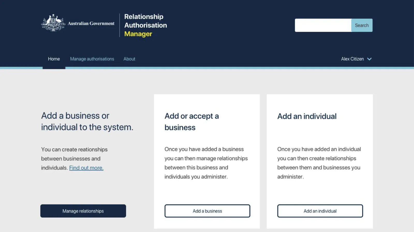
The round 3 prototype's home screen. Users could start by adding either a business or an individual.
The question
The Australian Taxation Office was building the Relationship Authorisation Manager (RAM) to replace AUSkey. RAM would let people record and manage who could act on behalf of a business with government, using a digital identity (at the time, myGovID). The question was whether people could actually use it, and what to change so they could.
Context
Usability was one of the criteria for signing off the work, and the ATO brought our team in because they already knew our research from the digital identity program. I was the user researcher in the Govpass Authorisation multi-disciplinary team at the Digital Transformation Agency, alongside a product manager, a service designer, an interaction designer, and a delivery manager. Our brief from the ATO was to recommend improvements to RAM’s interface, in line with the DTA’s design standards. Signing up for a digital identity was outside our scope. I co-authored the final report with service designer David Wall in November 2018.
What I did
Three rounds of testing. We tested with 18 people who worked in business and had used AUSkey in the previous six months: nine owners and nine representatives, from industries including accounting, construction, food manufacturing, and physical therapy, aged from their twenties to their sixties. Each round tested a new prototype, revised using the previous round’s results and input from ATO and DTA subject matter experts.
Measurable tasks. Participants worked through five scenarios: setting up a business and authorising someone, changing their permissions, removing them, accepting an authorisation request, and logging out. I scored every scenario as a success, partial success, or fail against defined criteria, so results could be compared across rounds rather than judged by impression. One participant who did not meet the screening criteria was excluded from the success metrics.
More realistic sessions. In the first two rounds, participants played a fictional user, “Alex Citizen”. In the third round, they entered their own details, which customised the prototype, so they were working with something that looked like their own situation.
An EEG trial. People in usability tests often say what they think the facilitator wants to hear, or present themselves in the best light. So what they report can differ from how they actually perform. To get a measure that did not depend on self-report, we trialled a low-cost EEG headset with four participants to track changes in cognitive workload. Spikes in the readings lined up with the moments on video where participants hit unexpected content or were unsure what to do.
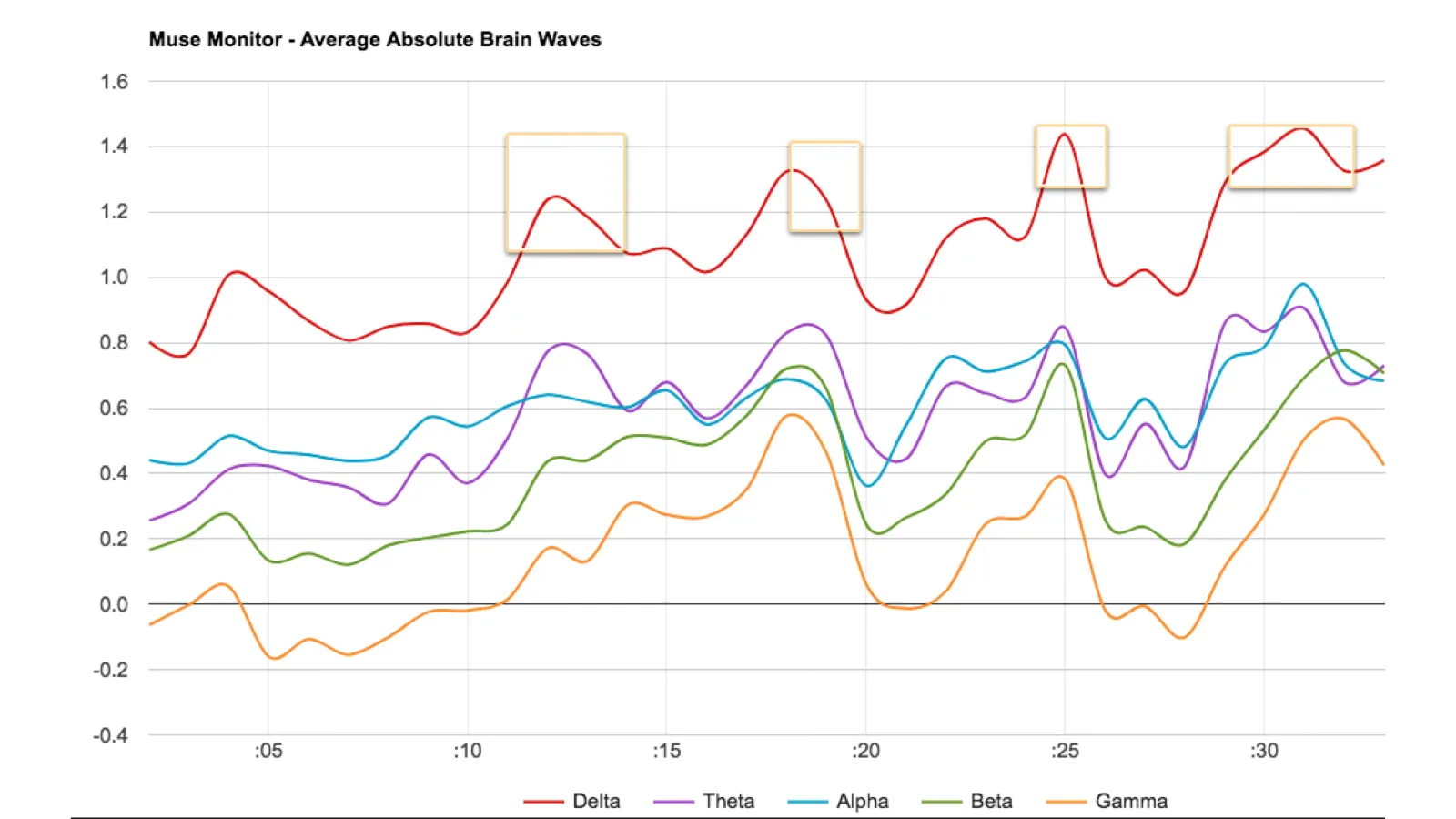
EEG readings from a session. The highlighted spikes matched moments on video where the participant was struggling.
What we found
- People don’t think in terms of “authorisation”. They think about getting a task done, or in terms of systems they already know, like AUSkey. A system for managing authorisation separately from the work strips away the context that makes it understandable.
- People wanted different ways in. Some expected to add the business first and then the person, others the reverse. Both were reasonable, and forcing one order caused failures.
- Two different codes caused the most trouble. Participants confused the code for logging in with their digital identity with the code for accepting an authorisation. The EEG readings agreed: accepting an authorisation request produced the most spikes.
- Some people could not use the system at all. At the time, many people got work done by sharing AUSkeys. Digital identity would rule that workaround out, so some users would be left unable to complete their work.
What changed between rounds
The third round changed the structure, not just the screens. Users could add either a business or an individual first, and create the relationship afterwards. The email inviting someone to accept an authorisation now linked straight to the acceptance screen, rather than to the log-in page. Logging out was made easier to find.
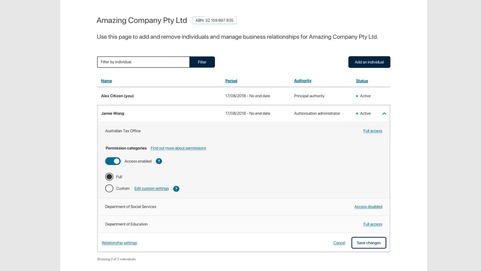
Managing an individual's permissions, agency by agency, in the redesigned prototype.
Results
Task success rose from 76% across the first two rounds to 98% in the third. In the final round, four of the five scenarios scored 100%, and changing someone’s permissions scored 91%.
| Measure | Round 1 | Round 2 | Round 3 |
|---|---|---|---|
| System Usability Scale | 68.5 (C, marginal) | 60 (D, marginal) | 74 (B, good) |
| Net Promoter Score | −16 | 0 | +33 |
The usability score moved from “marginal” to “good”, which is a strong result for a utilitarian government system. The Net Promoter Score rose too, but with six people per round that change is not statistically significant, so we treated it as a supporting signal rather than evidence.
We recommended that RAM keep the flexible workflow, and that an online system relying on digital identity should not be the only way to get this work done, because some users would be locked out. We also recommended an onboarding video, since people regularly confused myGov with myGovID.
What still needed fixing
The hardest problems sat outside RAM itself. People struggled to tell myGov from myGovID, and to understand how to register for a digital identity. Those difficulties would affect RAM however well it was designed.
The confusion lasted. In November 2024 the ATO renamed myGovID to myID, saying the change aimed “to resolve confusion between the myGovID app and myGov”.
His ability to understand complex concepts and apply good research theory to avoid bias and build empathy was a strong benefit to our team.
Lisa Jansen, UX Lead, Digital Transformation Agency